What should the card "backs" look like?
+12
Tangram
slyder
dustbunny
TheCharles
Illumina
anne e
glunsforddavis
Forbidding
Wootfish
Cubist
naturalismus
davehwng
16 posters
Page 1 of 3 • 1, 2, 3 
 What should the card "backs" look like?
I have a blog post that looks into this nuance (http://phylogame.msl.ubc.ca/2010/04/06/design-us-a-card-backing/). This thread would be a great place for discussion on this, as well as presentation of possible card back images.
Specifically, the blog post says:
Specifically, the blog post says:
This is a general call for the design of something that can go on the "backs" of our cards. Essentially, we hope to offer a pdf file that can be downloaded for people to print (after turning around the paper that has the card fronts). There are a few stipulations.
1. Best if the image is busy enough so that we do not have to print align card "backs" with card "fronts." In other words, we hope to have a design complex enough that can be cut in any way so that players cannot distinguish what they have in their hands.
2. Best if the image looks good in grayscale as well. For the option of printing in black and white.
3. Best if the image has some sort of biodiversity connection (this is the bit where you can fun with this).
Anyway, do go to this forum thread if you have ideas, suggestions, or submissions.
davehwng- Admin
- Posts : 244
Join date : 2010-01-29
Location : UBC
 Re: What should the card "backs" look like?
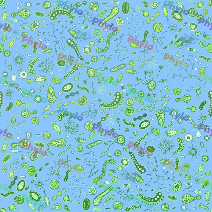
I think a seamless pattern would be nice. I found this cool vector and had to use it: http://dragonartz.wordpress.com/2009/05/08/bacteria-and-virusses-vector/


naturalismus- Posts : 38
Join date : 2010-02-22
 Re: What should the card "backs" look like?
I came up with two different ways to handle the logo...
One: The logo is repeated with 60° rotational symmetry, and with the "l"s of "Phylo" actually overlapping on occasion.
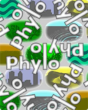
Two: The logo, repeated indefinitely, with a 70° tilt.

The background of these two card-images is, of course, based on the seven 'icons' we are apparently using for different terrain-types.
One: The logo is repeated with 60° rotational symmetry, and with the "l"s of "Phylo" actually overlapping on occasion.

Two: The logo, repeated indefinitely, with a 70° tilt.

The background of these two card-images is, of course, based on the seven 'icons' we are apparently using for different terrain-types.
Last edited by Cubist on Thu Apr 15, 2010 11:44 am; edited 1 time in total (Reason for editing : added a bit of whitespace)
Cubist- Posts : 43
Join date : 2010-02-07
 Re: What should the card "backs" look like?
I like your 60° rotational symmetry idea. Copied it 


naturalismus- Posts : 38
Join date : 2010-02-22
 Re: What should the card "backs" look like?
That's pretty cool. As we're overlapping a variety of patterns. Maybe a way to go about this, is to find other similar patterns but with different organisms represented. That might produce a card backing that is busy, but if the viewer looks closely, he/she will see all sorts of pertinent shapes plus the logo!
davehwng- Admin
- Posts : 244
Join date : 2010-01-29
Location : UBC
 Re: What should the card "backs" look like?
I'm not so sure about that idea... There couldn't be variation between cards, obviously, and it would be hard to pick just a few animals to be on the back of every card. That would kinda run counter to the message of biodiversity.
Personally, I think naturalismus's second picture is just about perfect. But that's just me.
Personally, I think naturalismus's second picture is just about perfect. But that's just me.

Wootfish- Posts : 88
Join date : 2010-04-15
Location : A little slice of your consciousness.
 Re: What should the card "backs" look like?
I've purchased a few animal card decks and most of them had backs with animals aranged in the way davehwng described. One in particular was exceptionally beutiful.
 Re: What should the card "backs" look like?
Could you post a picture of the one you liked? Or, if not, maybe specify what the deck is called so that others can find it themselves?Forbidding wrote:I've purchased a few animal card decks and most of them had backs with animals aranged in the way davehwng described. One in particular was exceptionally beutiful.

Wootfish- Posts : 88
Join date : 2010-04-15
Location : A little slice of your consciousness.
 Re: What should the card "backs" look like?
The specific problem with Natuiralismus' images is that their background is the serious overemphasis on unicellular critters. It would be nice to also include a few metazoans and maybe plants. Perhaps an MCEscher-like 'tiling' would be appropriate?
Cubist- Posts : 43
Join date : 2010-02-07
 Re: What should the card "backs" look like?
I totally agree. I just couldn't find any free animal+plant patterns.Cubist wrote:The specific problem with Natuiralismus' images is that their background is the serious overemphasis on unicellular critters. It would be nice to also include a few metazoans and maybe plants.

naturalismus- Posts : 38
Join date : 2010-02-22
 Re: What should the card "backs" look like?
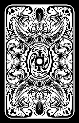
The one I really like I cannot find an image of, but here is the next best one. Its from an animal card deck called the Beastiary witch has been out of print for many years now.

 Re: What should the card "backs" look like?
My original comment about other patterns is along the lines of what cubist is suggesting (i.e. not just limited to microorganisms). However, I do agree that Naturalismus' back is pretty cool.
A way to explain this is to say that the card backs are microbial, because in reality, the vast majority of biodiversity exists in the microbial world. i.e. the card backs is a scientifically literate nod to this reality, even though microbes may be (and probably will remain) underrepresented in the cards themselves.
Anyway, if this sounds like a good idea, we'll need to do a few things:
1. get permissions for the pattern (I see it's under a workable creative commmon's license, but it's still a good idea to follow up.
2. Maybe try some different colour schemes, just to see?
davehwng- Admin
- Posts : 244
Join date : 2010-01-29
Location : UBC
 Re: What should the card "backs" look like?
I went in a little different direction. First, these prominently features the logo, which is good for cards that cannot be used as regular playing cards. Plus if we don't have packaging, the back of the card is one of the only places to remind people what the name of the game is. Finally, if we plan on using face-down cards as a game mechanic (as has already been suggested and is common practice in games of this type), a back that is not a repeating pattern is visually helpful.
All of that said, these are just my rough first draft. Whether you disagree with my ideas, my design, or my fabulously complex drawing, I am open to criticism. If you're interested in the source files to modify, let me know.


All of that said, these are just my rough first draft. Whether you disagree with my ideas, my design, or my fabulously complex drawing, I am open to criticism. If you're interested in the source files to modify, let me know.


glunsforddavis- Posts : 16
Join date : 2010-04-21
 Re: What should the card "backs" look like?
I just learned about Phylomon... can't remember where, but it was from somebody talking about illustration projects. I'm an illustrator and designer and want to contribute.
Have you decided on a design for the back of the cards yet? And if not, is there a particular graphical direction you're leaning towards (like, for example, the all-over pattern of nature whats-its approach, which is the one I like )?
)?
Have you decided on a design for the back of the cards yet? And if not, is there a particular graphical direction you're leaning towards (like, for example, the all-over pattern of nature whats-its approach, which is the one I like
anne e- Posts : 1
Join date : 2010-05-08
 Re: What should the card "backs" look like?
I don't think there's been a verdict yet, so feel free to throw in anything you want. If you want to get a clearer picture of expectations, read the thread, take a look at some of the stuff people have been doing and take note of people's reactions to their work. As far as I know, the posts here are the only discussion we've had on this topic, so once you're done, you'll know about as much as any of us.

Wootfish- Posts : 88
Join date : 2010-04-15
Location : A little slice of your consciousness.
 Re: What should the card "backs" look like?
Seeing that May 22nd is the International Day of Biodiversity, let's set that as a deadline for a card back to go up on the mainsite! So far, Naturalismus is the frontrunner, but if there are others, we would all love to see them.
davehwng- Admin
- Posts : 244
Join date : 2010-01-29
Location : UBC
 Re: What should the card "backs" look like?
I agree on all fronts: it's important to have a representative and memorable logo. I love the first image for this, it's a strong candidate in my opinion.glunsforddavis wrote:I went in a little different direction. First, these prominently features the logo, which is good for cards that cannot be used as regular playing cards. Plus if we don't have packaging, the back of the card is one of the only places to remind people what the name of the game is. Finally, if we plan on using face-down cards as a game mechanic (as has already been suggested and is common practice in games of this type), a back that is not a repeating pattern is visually helpful.
Whether you disagree with my ideas, my design, or my fabulously complex drawing, I am open to criticism.
Illumina- Posts : 14
Join date : 2010-02-05
 Re: What should the card "backs" look like?
I do agree it's beautiful, but based on quite a few discussions with folks in social media/marketing networks, most advice would suggest a card backing that works with both the open access online version, and whatever possible high production versions that appear in the future. i.e. we really do need a back that works in the context of how the cards are self printed - this is where the busy element comes into play whereby you don't have to attempt to align fronts with backs and vice versa.
I do love the colour scheme though - maybe there's a way to adapt naturalismus' busy type pattern with a richer colour set? Anyway, let's keep at it. I'm in discussions with our local natural history museum (Beaty Biodiversity Museum) about the high production angle (as a museum fund raising mechanism), so am thinking the May 22nd deadline may be premature.
I do love the colour scheme though - maybe there's a way to adapt naturalismus' busy type pattern with a richer colour set? Anyway, let's keep at it. I'm in discussions with our local natural history museum (Beaty Biodiversity Museum) about the high production angle (as a museum fund raising mechanism), so am thinking the May 22nd deadline may be premature.
davehwng- Admin
- Posts : 244
Join date : 2010-01-29
Location : UBC
 Re: What should the card "backs" look like?
Just an idea, how about pawprints around the text:
Example:

Example:

 Re: What should the card "backs" look like?
This makes sense. However, wouldn't it be easiest for the user to print the .pdf double-sided? In that case, wouldn't the front and back automatically line up? That seems to be optimal.davehwng wrote:we really do need a back that works in the context of how the cards are self printed
Illumina- Posts : 14
Join date : 2010-02-05
 Re: What should the card "backs" look like?
I think most cards have the 'exact' same image for a back to eliminate any variation, or hint as to which card someone may draw next. Most cards also tend to keep a solid border for this reason.
 Re: What should the card "backs" look like?
That's a really cool concept. There's not a whole lot to critique, but I'd say it's definitely worth trying to make a full back image from that concept.Forbidding wrote:Just an idea, how about pawprints around the text:
Example:

Wootfish- Posts : 88
Join date : 2010-04-15
Location : A little slice of your consciousness.
 Re: What should the card "backs" look like?
That's a cool idea. Is it possible to integrate plants and other life-forms?Forbidding wrote:Just an idea, how about pawprints around the text:
Example:

naturalismus- Posts : 38
Join date : 2010-02-22
 Re: What should the card "backs" look like?
That's a cool idea. Is it possible to integrate plants and other life-forms?
I'm not sure but I was playing around with it before and did a bit of a leaf pattern into it:

 Re: What should the card "backs" look like?
Ew, no. No offense, but that looks way too busy and also kind of sloppy. Sorry D:
Last edited by Wootfish on Tue May 25, 2010 3:48 pm; edited 1 time in total

Wootfish- Posts : 88
Join date : 2010-04-15
Location : A little slice of your consciousness.
Page 1 of 3 • 1, 2, 3 
 Similar topics
» On "1st player advantage" problem
» Latin Names (Polinomials)
» Card Types
» About card content
» Card Limits
» Latin Names (Polinomials)
» Card Types
» About card content
» Card Limits
Permissions in this forum:
You cannot reply to topics in this forum