Card Mock Ups (mainly due to WIRED piece deadline which is monday morning BTW!)
+9
ginasketch
rageofanath
jleeger
Pikachu
ensimismada
naturalismus
Brenda
Cubist
davehwng
13 posters
Page 1 of 2 • 1, 2 
 Card Mock Ups (mainly due to WIRED piece deadline which is monday morning BTW!)
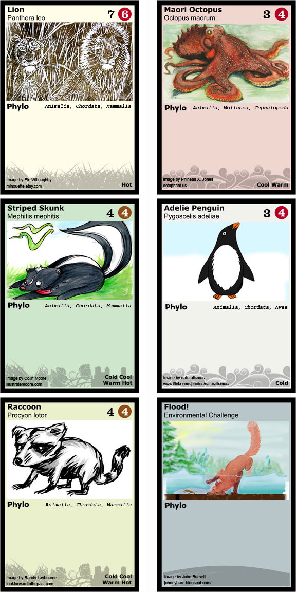
Worked on some card mock ups tonight. WIRED wanted some newish images for their piece, so I figured it was a good time to take in the commentary on the forum, and mock up an image that could be usable.
Some design schematics to highlight.
1. Fonts are all browser friendly (because we need this to work around CSS for both online viewing and dynamic printing).
2. Cannot overlap two images - hence solid backgrounds. Text over image (I believe) is o.k. at this point.
3. Top part of the card - name, latin name, and number for size/health?, and number with colour for food chain rank. I used the Clarendon font for this (not browser friendly, but because there is a limited number of parameters, we can make a limited number of buttons for this).
4. Image is at 2.4 x 1.5 inches (@150dpi) as stated in flickr submissions.
5. Immediately below image is the logo (however that may be in the future). Also thought I would include Kingdom, Phyla, and Class here (maybe useful for evolution themed or phylogeny themed games of the future).
6. Big blank space for flexible text (seems to be a trend in most trading card design layouts. This will be especially handy for all the organisms that do cool things, seem to be exceptions from general trends, etc.
7. At the bottom, is transparent silhouettes that will essentially signify biomes (sideways view) that organism is o.k. with (thinking setting things up so that there is room for up to three different biomes at once).
8. Bottom right is the artists name and website.
9. Bottom left is the temperature range that organism is o.k. with. For now, have gone with a pretty simple 4 word system.
Anyway, let me know what you think.

davehwng- Admin
- Posts : 244
Join date : 2010-01-29
Location : UBC
 Re: Card Mock Ups (mainly due to WIRED piece deadline which is monday morning BTW!)
I can see why you might want to have a web-friendly card-mockup, because that's closest to what people will actually see online. At the same time, it would also be appropriate to have a different flavor of mockup, namely, something that looks more like an actual printed card. Not only is that something the Phylomon project may well do, but in addition, it can look a heck of a lot sharper, since the "printed card" mockup won't be handicapped by the restrictions of online/CSS presentation. Like so:
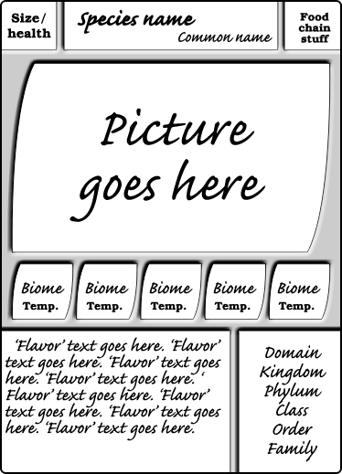
If you like this image, feel free to grab it and erase its existing text and use it as the basis for a second family of card-mockups.

If you like this image, feel free to grab it and erase its existing text and use it as the basis for a second family of card-mockups.
Cubist- Posts : 43
Join date : 2010-02-07
 Re: Card Mock Ups (mainly due to WIRED piece deadline which is monday morning BTW!)
Hey Quentin, that looks great!
Unfortunately, there's a reason that the web and printed version need to look the same. The website being scripted is done in such a way so that the card is made dynamically (i.e. printed in high res from the online image).
We're doing this so as to avoid two levels of card set-up to make access to cards as low a maintenance procedure as possible. Because of this, we have to adhere to the lowest common denominator for card layout, which unfortunately, is defined by CSS quirks.
The perk, is that the cards practically make themselves, taking in data from the flickr site, and the information content is done by clicking choices and typing in the flexible text much like a post on the blog (and the site will reconstruct the card).
Note that as the website will be run on wordpress, it will be open source, which means you never know - down the road, someone could figure out how to set it up so that more elaborate formatting can occur.
davehwng- Admin
- Posts : 244
Join date : 2010-01-29
Location : UBC
 Re: Card Mock Ups (mainly due to WIRED piece deadline which is monday morning BTW!)
Really like the mock ups Dave. Nice and colorful and easy to look at - a lot of information is laid out in a way that doesn't seem crowded. IMHO - I think they look pretty sharp already!
If I had a suggestion, it's to avoid Clarendon - there's some visual overlap with that font and a bolded times. That way you can still go the CSS font route which I would imagine is waaaaayy easier for the programming side. I think it won't take away the look that much.
If I had a suggestion, it's to avoid Clarendon - there's some visual overlap with that font and a bolded times. That way you can still go the CSS font route which I would imagine is waaaaayy easier for the programming side. I think it won't take away the look that much.
Brenda- Posts : 7
Join date : 2010-02-03

naturalismus- Posts : 38
Join date : 2010-02-22
 Re: Card Mock Ups (mainly due to WIRED piece deadline which is monday morning BTW!)
I like Cubist's idea of having the classification (kingdom/phylum/class/order/family) in descending vertical order. Just makes more intuitive sense to me.
I love the looks of the shaded habitat icons at the bottom of that first set of cards. Exactly the sort of thing I had in mind. The hot/warm/cool/cold is a nice touch, too. But, for the love of Linnaeus, Darwin, and all the giants whose shoulders upon which we stand, the scientific names (species and genus) have got to be italicized. By convention, the kingdom through subfamily names aren't italicized but they are capitalized.
Also, going as specific as family risks dating the cards of species whose taxonomic status is unclear. For example, most snake taxonmists aren't pleased with the idea of Colubridae as the "junk drawer" of 60% of snake species and revisions are in the works. It also takes up a lot of card face real estate listing all of that information.

ensimismada- Posts : 22
Join date : 2010-02-26
 Re: Card Mock Ups (mainly due to WIRED piece deadline which is monday morning BTW!)
But, for the love of Linnaeus, Darwin, and all the giants whose shoulders upon which we stand, the scientific names (species and genus) have got to be italicized
Yes, will fix that immediately!
As far as the classification going vertical, will have a go at seeing how that might look tonight.
davehwng- Admin
- Posts : 244
Join date : 2010-01-29
Location : UBC
 Re: Card Mock Ups (mainly due to WIRED piece deadline which is monday morning BTW!)
Hmmm... just looking through different labels, and the vertical approach may be tricky, in that because some of the nomenclature is really long, it may inadvertently take up a lot of card real estate. i.e. a word like "Chlorarachniophytes" would take up a lot of column width and you can only go so small with the font.
Horizontally, if I take the font down just a bit, I just "barely" have enough room for the kingdom/phylum/class if all are represented by these huge words! (maybe a tiny bit more if I make the logo a titch smaller).
Anyway, will play around in more detail tonight.
Horizontally, if I take the font down just a bit, I just "barely" have enough room for the kingdom/phylum/class if all are represented by these huge words! (maybe a tiny bit more if I make the logo a titch smaller).
Anyway, will play around in more detail tonight.
davehwng- Admin
- Posts : 244
Join date : 2010-01-29
Location : UBC
 Re: Card Mock Ups (mainly due to WIRED piece deadline which is monday morning BTW!)
Alternatively, one could use the common names of each level of classification. For example, "chordates" instead of "Chordata" or "sac fungi" instead of "Ascomycota."
... because I know the average soccer mom isn't going to be able to pronounce a lot of these words. Intrepid, dinosaur-loving kids might figure it out, but a lot of Greek and Latin can be off-putting and we're not in the business of intimidation.
Part of what made Pokémon fun was their silly names (Arcticuno, Zapdos, and Moltres, for example) and unfortunately there's not a lot of leeway for that sort of play with Phylomon.

ensimismada- Posts : 22
Join date : 2010-02-26
 Re: Card Mock Ups (mainly due to WIRED piece deadline which is monday morning BTW!)
I guess we could go with the common names, but personally, I LOVE the idea of children going around saying words like "Chlorarachniophytes." How awesome would that be? It would totally make this project worth it!
davehwng- Admin
- Posts : 244
Join date : 2010-01-29
Location : UBC
 Re: Card Mock Ups (mainly due to WIRED piece deadline which is monday morning BTW!)
Oh, I agree! I adore biological nomenclature and think kids might, too. I'm simply mentioning that the challenge is getting them to learn and say them. There's a quote about "if I could remember all of these names, I'd have become a botanist!" or Phylomon collector, as the case may be.
These cards are going to be loaded with information, so it's probably best to put a lot of thought into picking and choosing what's most important for the game mechanics and what we want want them to be learning from it all. The ultimate source of information for kids is their parents and if mom and dad can't make a guess as to how to pronounce words the mechanics of the game give importance to, that's going to create some frustration. How many of these kids are budding readers? Probably many of them. I have college biology students who can't pronounce half of the words I put to them, despite having heard me lecture using those words not ten minutes before.
If the taxonomy is just "flavor text," then there's less pressure. Maybe we could provide a sound file in the website supplementary material, or a simple pronunciation key? That's what the shark card game did: http://www.powersharks.com/facts.html

ensimismada- Posts : 22
Join date : 2010-02-26
 Re: Card Mock Ups (mainly due to WIRED piece deadline which is monday morning BTW!)
There's also one here.
http://www.elasmo-research.org/education/classification/pronunciation.htm
With the website, the main idea is that each card represents something like a highly formatted blog post. I'll make sure we can have options where referral websites can be highlight (even though they may not show up on the card itself).
davehwng- Admin
- Posts : 244
Join date : 2010-01-29
Location : UBC
 Re: Card Mock Ups (mainly due to WIRED piece deadline which is monday morning BTW!)
Images at the top are very pretty. I could easily imagine players wanting to get more and more. Is there a reason why a specific background color is chosen or is that just about finding something that works well with the animal picture?
Pikachu- Posts : 14
Join date : 2010-02-01
 lions and octopus
I love the lion and octopus cards...I think a touch of realism is important in this project...or else you've merely created another bunch of cartoon characters (detached from nature)
jleeger- Posts : 1
Join date : 2010-03-03
 Re: Card Mock Ups (mainly due to WIRED piece deadline which is monday morning BTW!)
These look great, I like the symbols at the bottom of the cards.
Small fix to make them look more professional though, put a thin black line around the image area.
Small fix to make them look more professional though, put a thin black line around the image area.

rageofanath- Posts : 8
Join date : 2010-02-01
Location : Boston
 CC licensing
I wanted to point out naturalismus's use of the Creative Commons symbols on the card layout. If the game is going to be released under CC licensing (which it ought to be), I think it's definitely a good idea to include those symbols.

ensimismada- Posts : 22
Join date : 2010-02-26
 Re: Card Mock Ups (mainly due to WIRED piece deadline which is monday morning BTW!)
Does anyone know which issue of Wired the Phylo piece will be in? 
ginasketch- Posts : 6
Join date : 2010-03-03
Location : London, UK
 Re: Card Mock Ups (mainly due to WIRED piece deadline which is monday morning BTW!)
I was told it would come out in May sometime and that this would be the UK version of the magazine (not sure if that means it doesn't appear in the US version). Anyway, when I get my hands on it (assuming it doesn't get the kill, I'll make sure to scan and put here).
davehwng- Admin
- Posts : 244
Join date : 2010-01-29
Location : UBC
 Re: Card Mock Ups (mainly due to WIRED piece deadline which is monday morning BTW!)
Excellent. I'll keep an eye out for it. 
ginasketch- Posts : 6
Join date : 2010-03-03
Location : London, UK
 Re: Card Mock Ups (mainly due to WIRED piece deadline which is monday morning BTW!)
How about including phonetic versions of the Latin names on the cards? I could see some players running into difficulty figuring out how, say, "Pygoscelis adeliae" is pronounced, so it might be a nice way to make the names less intimidating.

Wootfish- Posts : 88
Join date : 2010-04-15
Location : A little slice of your consciousness.
 Re: Card Mock Ups (mainly due to WIRED piece deadline which is monday morning BTW!)
Maybe it could be included on the cards the current conservation status of it Ex: Least Concern, Extinct, ect. But this would also mean updating the cards if the animals status should change.
Anouther idea if the space in the middle of the card is not used I think a simple description of the animal should be put there. Pokemon cards have this in a small box at the very bottom of the card.
Anouther idea if the space in the middle of the card is not used I think a simple description of the animal should be put there. Pokemon cards have this in a small box at the very bottom of the card.
 Re: Card Mock Ups (mainly due to WIRED piece deadline which is monday morning BTW!)
That sounds like a good idea. However, we don't want to clutter up the cards. It's obvious that a simple layout is necessary to keeping the game non-intimidating. If one takes a look at successful trading card games, it's apparent that they all have made an effort to keep the layout as uncomplicated as possible. There is definitely a balance to be struck between providing information and cluttering up the card.
I suppose it would depend on how much gameplay-value the information has. Another thing that one notices about the cards I've linked is that virtually everything on them except flavor-text and artists' names is relevant to the gameplay. Obviously it would be tempting in an educational game to fit more in, but that seems to me like something that would appeal more to us than to the target audience.
I clearly recall that whenever I encountered "edutainment" games (and I apologize in advance for using such an absolutely hideous abomination of a word), the thing that majorly repulsed me was how there was always The Game, which is what I wanted to play, and then layered on top of it was unneeded trivia that simply got in the way and made the experience less fun. I would want to avoid that sort of thing. A line or two of out-of-the-way flavor text is fine. But everything else has to tie into how the game is played. We have to make sure that
As rageofanath put it, we need to be ninjas about the educational dimension of the game.
And so with that in mind, perhaps it would be a good idea to hold off this sort of discussion until we're more certain of what the rules will look like.

Wootfish- Posts : 88
Join date : 2010-04-15
Location : A little slice of your consciousness.
 Re: Card Mock Ups (mainly due to WIRED piece deadline which is monday morning BTW!)
Just in. Coming out in June for sure (didn't get killed). The cards they have chosen are (for the graphics), the lion, the red panda and the penguin. I believe Naturalismus you did the penguin image, so woo hoo - you'll be in the magazine!
davehwng- Admin
- Posts : 244
Join date : 2010-01-29
Location : UBC
 Re: Card Mock Ups (mainly due to WIRED piece deadline which is monday morning BTW!)
wow. that's pretty cool.davehwng wrote:Just in. Coming out in June for sure (didn't get killed). The cards they have chosen are (for the graphics), the lion, the red panda and the penguin. I believe Naturalismus you did the penguin image, so woo hoo - you'll be in the magazine!

naturalismus- Posts : 38
Join date : 2010-02-22
 Re: Card Mock Ups (mainly due to WIRED piece deadline which is monday morning BTW!)
Congrats!naturalismus wrote:wow. that's pretty cool.davehwng wrote:Just in. Coming out in June for sure (didn't get killed). The cards they have chosen are (for the graphics), the lion, the red panda and the penguin. I believe Naturalismus you did the penguin image, so woo hoo - you'll be in the magazine!

Wootfish- Posts : 88
Join date : 2010-04-15
Location : A little slice of your consciousness.
Page 1 of 2 • 1, 2 
 Similar topics
» Card Mock Ups For Printing
» Latin Names (Polinomials)
» Card Types
» About card content
» Card Limits
» Latin Names (Polinomials)
» Card Types
» About card content
» Card Limits
Permissions in this forum:
You cannot reply to topics in this forum
