Other graphics: The logo
Page 1 of 2 • 1, 2 ![]()

Other graphics: The logo
![]() Cubist Mon Feb 08, 2010 3:33 am
Cubist Mon Feb 08, 2010 3:33 am

Taking away the Photoshop magic, here's how that logo looks as solid black letterforms and as a set of outlines:


These letterforms can be used in other words. As an example, here's how my proposed alternate name, Phylogen, looks in those three styles:


Cubist- Posts : 43
Join date : 2010-02-07
Re: Other graphics: The logo
![]() naturalismus Mon Feb 08, 2010 5:34 pm
naturalismus Mon Feb 08, 2010 5:34 pm

naturalismus- Posts : 5
Join date : 2010-02-03
Re: Other graphics: The logo
![]() Vivienne Tue Feb 09, 2010 5:03 am
Vivienne Tue Feb 09, 2010 5:03 am
Vivienne- Posts : 10
Join date : 2010-02-02
Re: Other graphics: The logo
![]() fenrislorsrai Tue Feb 09, 2010 7:25 pm
fenrislorsrai Tue Feb 09, 2010 7:25 pm
I'm also concerned about how this would look at a smaller size. Keep in mind it has to look good at both a large size and at many smaller sizes. I'm not sure this would be easy to read when taken down to easy to fit on an internet button banner.

fenrislorsrai- Posts : 104
Join date : 2010-02-04
Age : 45
Location : Bethel, CT -

Re: Other graphics: The logo
![]() rawrchiteuthis Tue Feb 09, 2010 7:48 pm
rawrchiteuthis Tue Feb 09, 2010 7:48 pm

rawrchiteuthis- Posts : 13
Join date : 2010-02-01 -
Re: Other graphics: The logo
![]() Cubist Wed Feb 10, 2010 12:04 pm
Cubist Wed Feb 10, 2010 12:04 pm
[nods] I see your point; that logo looks the way it does because I was going for a sci-fi kind of 'feel', in large part because of the "seeding a blank planet" schtick I proposed for an overall theme. Something with a higher level of organicness might well be better...fenrislorsrai wrote:I'm going to agree this looks very "hard" and artificial and doesn't quite convey it's about plants and animals. Robots I'd believe, not animals.
Yep; that's why I did the "solid black" and "outlines" versions, either of which should be better-able to cope with low-res presentation than is the "full Photoshop magick" version.I'm also concerned about how this would look at a smaller size. Keep in mind it has to look good at both a large size and at many smaller sizes. I'm not sure this would be easy to read when taken down to easy to fit on an internet button banner.
Cubist- Posts : 43
Join date : 2010-02-07
Re: Other graphics: The logo
![]() Cubist Wed Feb 10, 2010 12:12 pm
Cubist Wed Feb 10, 2010 12:12 pm
Hmm. Not sure about that -- it seems to me that this idea would necessarily involve a bunch of fine details which would likely be lost at lower-resolution sizes.rawrchiteuthis wrote:It would be great if we could use animals to spell out the words, or have a series of ants creating the "bridge" to make the word L, a leopard resting within the middle part of the P.
Right now I am pondering the notion of 'assembling' the letterforms out of readily-identifiable parts of living things: For instance, the initial "P" could be two octopus-tentacles entwined together. The big question, for me, is making sure that everything remains readily recognizable at low resolutions.
Cubist- Posts : 43
Join date : 2010-02-07
Re: Other graphics: The logo
![]() naturalismus Wed Feb 10, 2010 7:17 pm
naturalismus Wed Feb 10, 2010 7:17 pm
I see your point. What about a logo with an artificial and an organic part? (Anything looking like the Eden Project would be cool ;-) )Cubist wrote:[nods] I see your point; that logo looks the way it does because I was going for a sci-fi kind of 'feel', in large part because of the "seeding a blank planet" schtick I proposed for an overall theme. Something with a higher level of organicness might well be better...fenrislorsrai wrote:I'm going to agree this looks very "hard" and artificial and doesn't quite convey it's about plants and animals. Robots I'd believe, not animals.
naturalismus- Posts : 5
Join date : 2010-02-03
Re: Other graphics: The logo
![]() davehwng Mon Feb 22, 2010 5:01 am
davehwng Mon Feb 22, 2010 5:01 am
*This being that having special "backgrounds" is problematic. The website pieces the cards via CSS positioning, so that you can look at the card on the web (looks nice), as well as print dynamically at highres. However, if you position images on top of each other, there's issues with the printing side of things. This, we've determined, we can get around by pdf generation scripts, but then that creates a much larger server strain, which could be problematic if the project gets really popular. Anyway, because of all of this, we're looking into a card "border" as oppose to a background (at least initially).
davehwng- Admin
- Posts : 244
Join date : 2010-01-29
Location : UBC
Re: Other graphics: The logo
![]() davehwng Fri Feb 26, 2010 10:44 pm
davehwng Fri Feb 26, 2010 10:44 pm
New name for project is potentially a simple "phylo"
davehwng- Admin
- Posts : 244
Join date : 2010-01-29
Location : UBC
davehwng- Admin
- Posts : 244
Join date : 2010-01-29
Location : UBC
Re: Other graphics: The logo
![]() Cubist Sat Feb 27, 2010 2:07 pm
Cubist Sat Feb 27, 2010 2:07 pm
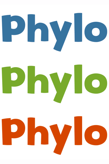
Hmmm... don't really care for it. IMAO ( = In My Arrogant Opinion), this typeface/design is just too overtly juvenile -- children within a specific age-range may well love it to pieces, but I kinda suspect children outside that specific age-range will not go for it (and we'll be lucky if they 'only' don't care about it one way or another, as opposed to being repulsed from something that's blatantly "for little kids").davehwng wrote:How's this look?
Cubist- Posts : 43
Join date : 2010-02-07
Re: Other graphics: The logo
![]() naturalismus Sat Feb 27, 2010 2:16 pm
naturalismus Sat Feb 27, 2010 2:16 pm
lolCubist wrote:IMAO
I actually like the design.

naturalismus- Posts : 38
Join date : 2010-02-22
Re: Other graphics: The logo
![]() Brenda Sat Feb 27, 2010 4:59 pm
Brenda Sat Feb 27, 2010 4:59 pm

The other thing is that a slight preference for branding towards the younger crowd might not be so bad, especially since the Science paper sort of tries to use Pokemon as the comparison model. This means that from a narrative point of view, working with the younger demographic (at least initially) is probably a smart thing (sorry for my PR lingo there).
Brenda- Posts : 7
Join date : 2010-02-03
Re: Other graphics: The logo
![]() davehwng Sat Feb 27, 2010 5:35 pm
davehwng Sat Feb 27, 2010 5:35 pm
davehwng- Admin
- Posts : 244
Join date : 2010-01-29
Location : UBC
Re: Other graphics: The logo
![]() Pikachu Sat Feb 27, 2010 6:13 pm
Pikachu Sat Feb 27, 2010 6:13 pm
Pikachu- Posts : 14
Join date : 2010-02-01
Re: Other graphics: The logo
![]() naturalismus Sat Feb 27, 2010 6:36 pm
naturalismus Sat Feb 27, 2010 6:36 pm
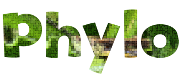
We could put a picture in it:


naturalismus- Posts : 38
Join date : 2010-02-22
Re: Other graphics: The logo
![]() Cubist Sat Feb 27, 2010 7:08 pm
Cubist Sat Feb 27, 2010 7:08 pm
It may be that we do want to appeal to one (or more) specific group of kids and not care about anybody else... but if we do that sort of thing, it should be a considered decision, not something that just kinda happened, yes?
Cubist- Posts : 43
Join date : 2010-02-07
Re: Other graphics: The logo
![]() davehwng Sat Feb 27, 2010 7:21 pm
davehwng Sat Feb 27, 2010 7:21 pm
If 6-year-olds think that Phylo(mon) is way-cool, that's great. If 13-year-olds dismiss Phylo as something that's "for little babies", now that may not be so great. All I'm sayin' is, we want to be careful about doing stuff which will entice one group of kids while, at the same time, repulsing other groups of kids.
It may be that we do want to appeal to one (or more) specific group of kids and not care about anybody else... but if we do that sort of thing, it should be a considered decision, not something that just kinda happened, yes?
Hmmm... that's a good point. We don't want to restrict ourselves too early in the game. Still, I'm wondering if we're making too big a deal over this artistic rendition of a font, but I think I have a good way to sort it out.
In terms of timing, it works out pretty well that my lab is hosting a high school student conference next Friday (link), and I'll make sure to get the opinion of the 100 or so teenagers there!
davehwng- Admin
- Posts : 244
Join date : 2010-01-29
Location : UBC
Re: Other graphics: The logo
![]() naturalismus Sat Feb 27, 2010 7:30 pm
naturalismus Sat Feb 27, 2010 7:30 pm
True.Cubist wrote:All I'm sayin' is, we want to be careful about doing stuff which will entice one group of kids while, at the same time, repulsing other groups of kids.
Has anyone thought about how girls like collectible card games?
naturalismus- Posts : 38
Join date : 2010-02-22
Re: Other graphics: The logo
![]() delirium Sat Feb 27, 2010 7:43 pm
delirium Sat Feb 27, 2010 7:43 pm

This is an interesting way of doing things. Negative space works well, and could easily stay readable.

delirium- Posts : 7
Join date : 2010-02-27

naturalismus- Posts : 38
Join date : 2010-02-22
Re: Other graphics: The logo
![]() delirium Sat Feb 27, 2010 9:13 pm
delirium Sat Feb 27, 2010 9:13 pm
If I remember, I'll throw together something when I get home.
(Edit: Sans-serif is also key! And no Helvetica, Arial, or Comic Sans because those are the equivalent of committing designicide.)
delirium- Posts : 7
Join date : 2010-02-27
Re: Other graphics: The logo
![]() Cubist Sat Feb 27, 2010 11:22 pm
Cubist Sat Feb 27, 2010 11:22 pm
I haven't. But now that you mention it, we definitely want to make sure that Phylo is good/attractive/interesting for females as well as males. No damn sense in blowing off 50% of the population, right?naturalismus wrote:True.Cubist wrote:All I'm sayin' is, we want to be careful about doing stuff which will entice one group of kids while, at the same time, repulsing other groups of kids.
Has anyone thought about how girls like collectible card games?
Cubist- Posts : 43
Join date : 2010-02-07
Re: Other graphics: The logo
![]() Cubist Sat Feb 27, 2010 11:30 pm
Cubist Sat Feb 27, 2010 11:30 pm
"Too big a deal"? Disagreement. The logo will be Phylo's "public face" -- it will show up on the Phylo cards, in news media presentations about Phylo, on message board posts, etc etc etc. I believe it would be foolish not to worry about how the logo will appear in isolation, separate and distinct from any/every other part of the Phlyomon project. You never get a second chance to make a first impression, right?davehwng wrote:If 6-year-olds think that Phylo(mon) is way-cool, that's great. If 13-year-olds dismiss Phylo as something that's "for little babies", now that may not be so great. All I'm sayin' is, we want to be careful about doing stuff which will entice one group of kids while, at the same time, repulsing other groups of kids.
It may be that we do want to appeal to one (or more) specific group of kids and not care about anybody else... but if we do that sort of thing, it should be a considered decision, not something that just kinda happened, yes?
Hmmm... that's a good point. We don't want to restrict ourselves too early in the game. Still, I'm wondering if we're making too big a deal over this artistic rendition of a font, but I think I have a good way to sort it out.
Yay! I, for one, look forward to seeing how real kids will like Phylo.In terms of timing, it works out pretty well that my lab is hosting a high school student conference next Friday (link), and I'll make sure to get the opinion of the 100 or so teenagers there!
Cubist- Posts : 43
Join date : 2010-02-07
Page 1 of 2 • 1, 2 ![]()
|
|
|